This is the first image I have chosen to research. The advertising style of this image is very minimal, with a plain background and well organised and planned composition. We can see that the photographer has shot this image within a studio, and they have used soft lighting which may have been soft boxes. We know because of the softness and lack of shadows the objects are creating. We can see that the objects have been lit from above also due to the shadow. The composition has been successfully achieved as the layout of the objects allow us to travel throughout it an also the random pops of colour also adds to the composition.

This is the second image i have chosen, we can see from this that this image is a more obvious advertising image. We can see this because the whiskey bottle is branded. This type of advertising would appeal to an older generation who perhaps already buy this type of product. We can see that again a soft lighting has been used and the bottle has been lit from a variety of angles. The bottle has been evenly lit from left, right, centre and above. We can see that very little light has been projected onto the background as only a very small portion of it is lit. The composition works well as the bottle is the focal point of the image but it then lead oure eyes to the glass of whiskey with ice.

This is the third image which i am going to analyse. This one is particuarly different from the previous ones. We can see that this is is a bottle of aftershave which would appeal to a predominately male market. We can see that the concept of the advertising shoot has came from the name of the aftershave "cool water". The composition of this image has been well done as even though the bottle is more to the sude of the image, the ripples created in the water give more movement and texture to the image. The black colour of the water also makes the blue coloured bottle stand out more.

This is the fourth image which u have chosen to research. Again, we can see the relation to alcohol in this image which means it would appeal to an older more mature group of people. Th composition is well done i think as each glass is evenly spread out and also has a different object being dropped into it which makes the image more interesting. The use of the reflection also shows that the image has been lit from above and from both sides due to the soft shadows of the reflection.
This is the fifth image, we can see that this image is quite different from the others which i have researched. The type of lighting which has been used is rim lighting, this is created by using the black back ground and only lighting the edges of the glass. The composition has been successfully achieved as are yes travel throughout the image as the glasses have been placed in order of their size. This image would most likely appeal to the older generations who like drinking whiskey.
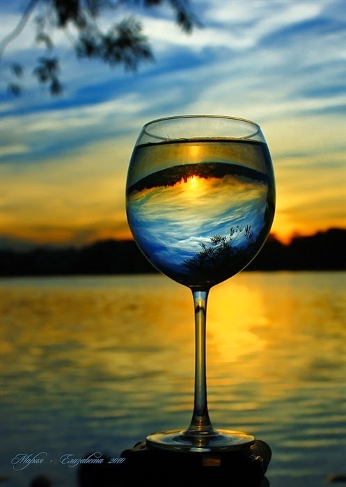
This is the sixth image which I have chosen. So far this is the only glassware image which has been taken on location. The type of lighting which has been used is clearly natural lighting which has been taken as sunset to give it a darker and more contrasty look. The good use of depth of field also allows us to focus on the glass. The composition works very well as the reflection of the sunset coming through the glass creates a more interesting image. This photograph would probably appeal to most
ages.
This is the seventh image which I have chosen. This image has a very well organised and thought out composition as we can see the photographer has clearly laid the objects out in order of size. This allows the viewers eyes to travel over the image. The use of the lines in the background gives the image more texture and creates interesting shapes. We can see the image has been lit more dully than the others and it appears that it is mostly lit from above.
This is the eighth image which i have chosen. The interesting shapes of the image have been specifically placed in order to create unusual shapes. This also adds to the composition fo the image as we can see that they have been places also the create the shadow reflections of each glass. There is very little colour in the image and it does appear quite dull.